What Wood Goes With Walnut: Stunning Pairing Guide
You’ll want to pair walnut with woods that complement its rich, chocolate tones and subtle purple or gray undertones. Light species like maple or ash add bright contrast, while white oak offers a neutral balance.
Cherry provides a smooth medium tone that shifts well. Match undertones carefully—warm with warm, cool with cool, and layer textures to avoid clashes. Proper lighting enhances walnut’s depth alongside darker woods. Keep going to explore detailed strategies for perfect harmony.
Key Takeaways
- Maple and ash provide bright contrast and texture that complement walnut’s deep brown tones for balanced visual interest.
- White oak offers a neutral base that harmonizes with walnut’s richness without overpowering its subtle undertones.
- Oak and cherry add warmth and medium tones, but cherry darkens over time, so oak is more stable alongside walnut.
- Match undertones by pairing walnut’s warm brown with soft taupes, beiges, or warm off-whites to avoid color clashes.
- Use repetition and layering of walnut with lighter woods and natural textiles to create cohesive, warm, and inviting interiors.
Popular Wood Species That Complement Walnut
Five wood species commonly complement walnut by offering distinct contrasts in color, grain, and aging behavior. This makes them practical choices for mixed-wood designs.
Maple’s light tone provides bright contrast to walnut’s deep brown, while white oak offers a neutral palette that balances and complements walnut’s richness. Selecting wood types with compatible grain texture ensures a harmonious and durable finish.
Maple brightens walnut’s deep hues, while white oak offers a balanced, neutral complement to its richness.
Ash introduces texture and brightness with its light color and distinct grain. Oak adds warmth through its golden hues, enhancing cozy environments when paired with walnut.
Cherry initially pairs well due to warm hues, but you should consider its darkening over time, which may clash with walnut’s stable brown.
When combining these woods, focus on balancing color contrast, grain texture, and finish compatibility. This will create durable, visually engaging, and practical mixed-wood applications in furniture and interiors. Incorporating natural materials like wool or linen alongside walnut furniture can further enhance the overall aesthetic and comfort.
Matching Undertones for Harmonious Wood Pairings
When pairing walnut with other woods, understanding its neutral to creamy brown undertones is essential for achieving visual harmony.
Walnut’s heartwood varies from medium to chocolate brown with subtle purplish or grayish hints, while its sapwood is pale blonde.
Its undertones sit between warm and cool, providing a calm, balanced base that pairs well with a broad spectrum of colors and woods. Walnut is historically seen in English cottage and traditional farmhouse interiors, highlighting its timeless appeal and versatility.
To maintain harmony, choose woods or finishes with similar neutral or creamy undertones, such as soft taupes, light beiges, or warm off-whites. Using tools with precision and accuracy can help create cleaner cuts when working with walnut and other woods.
Avoid woods or paints with strong red, pink, or gold hues, which can clash with walnut’s subtle warmth. Incorporating textiles and metals with neutral tones further ensures a cohesive, balanced look when mixing walnut with other wood species.
Balancing Light, Medium, and Dark Woods With Walnut
When you’re working with walnut, it’s all about layering those light, medium, and dark woods in a smart way to add some visual depth.
So, think about how you can mix and match these wood tones across your furniture, flooring, and accents. Using edge grain or end grain cutting boards made from walnut can also inspire how you handle wood grain orientation in your design choices.
It really helps create a sense of balance and cohesion in your space. By repeating each wood tone, you can avoid that awkward tonal clustering that sometimes happens. Plus, it really brings out the natural warmth and texture of walnut, making your room feel more inviting and well put together.
Keep in mind, however, that the primary cost in woodworking projects often comes from labor rather than materials, so choosing woods that are easier to finish can save time and effort.
Layering Wood Tones
Although walnut typically serves as a dark, grounding wood, layering it effectively with light and medium tones like maple or cherry creates visual depth and balance in interior spaces. Selecting complementary woods with similar grain textures enhances the overall aesthetic and durability of the design.
Start with a consistent, neutral flooring tone, such as white oak, to anchor the palette. Introduce walnut in major pieces like tables or consoles and repeat its presence in smaller accents, like frames, to maintain cohesion.
Distribute light and medium woods evenly across the room rather than concentrating them in one area, ensuring balanced flow. Match undertones—warm with warm or cool with cool—to enhance harmony. Applying a shellac wash coat to walnut before finishing can protect the surface and enhance its natural sheen, preserving the wood’s rich appearance.
Use at least two elements per wood tone to unify the design. This method prevents monotony, emphasizes walnut’s rich character, and strategically layers textures and tones for a well-proportioned, functional environment.
Visual Depth Strategies
Building on the concept of layering wood tones, achieving visual depth with walnut depends on carefully balancing light, medium, and dark woods.
Light woods like ash or maple offer contrast, brightening spaces and framing walnut’s rich grain without overpowering it. Medium tones such as cherry bridge color gaps, creating seamless progressions and enhancing complexity without muddiness. Proper maintenance of wood surfaces ensures longevity and preserves these visual qualities.
Dark woods like ebony add depth and sophistication but require ample lighting and lighter materials to avoid heaviness. Use dark woods sparingly as accents to maintain balance. Incorporating strategic lighting enhances the warmth and grain of walnut when paired with darker woods.
Strategically layer these woods across flooring, cabinetry, and furniture to create multidimensional environments. This controlled mix prevents monotony, highlights walnut’s distinctive texture, and guides visual flow.
It supports styles from modern minimalism to rustic-modern while maintaining clarity and cohesion throughout the design.
Textural and Color Contrast Considerations
When combining walnut with other materials or colors, consider how texture and contrast influence the overall design balance.
Walnut’s dark, smooth surface pairs well with textured elements like metal frames, leather accents, and natural fibers to add depth and warmth. Walnut desks supported by metal frames, for example, blend strength with warmth, creating a modern contrast that enhances home office spaces. Including elements that provide cutting accuracy in design details can further refine the overall aesthetic.
Incorporate glass for a sleek juxtaposition, enhancing refinement without overpowering walnut’s natural luster. For color, use neutral backgrounds to let walnut stand out, or introduce earth tones and gradients like light oak to complement its undertones.
Bold hues such as ruby red or deep green create lively contrasts but require careful moderation. Balancing walnut’s cool, rich undertones with yellowish oak or creamy whites softens shifts. Mixing smooth and textured materials ensures a dynamic, harmonious environment that respects walnut’s bold presence.
Wood Choices for Different Design Styles Featuring Walnut
When you’re using walnut in modern designs, it’s all about those clean lines! Try pairing it with metals or light upholstery. This combo really highlights the warmth of walnut without making things feel cluttered. You can also incorporate industrial-inspired furniture that features walnut for a striking look.
Now, if you’re leaning toward rustic or traditional styles, think about choosing complementary woods like oak or mahogany. These options really emphasize texture and rich tones, while still keeping everything balanced. For a natural and harmonious look, incorporating sage green or similar biofilic tones on the walls can beautifully complement walnut’s warmth.
And don’t forget to adjust your wood choices based on your design’s vibe—whether it’s minimalist or layered. This way, walnut’s natural elegance can really shine through.
Modern Pairings With Walnut
Although walnut’s rich tones naturally command attention, pairing it thoughtfully enhances modern interiors without overwhelming them. You can combine walnut with lighter woods like maple or ash to create balanced contrast and visual depth. This softens walnut’s intensity while maintaining modern clarity, and ensuring precise alignment with complementary materials can elevate the overall design.
Integrate black metal frames or accents for structural definition and a sleek industrial edge, especially under tabletops or in cabinet hardware. Walnut’s distinctive grain patterns add unique character when paired with metal detailing, creating striking focal points.
Incorporate glass surfaces to add lightness and highlight walnut’s grain without adding bulk, perfect for coffee tables or display cabinets. Using tools like a miter gauge can help achieve flawless cuts when crafting these elements.
Use neutral palettes—white, beige, or grey—as backdrops to emphasize walnut’s warmth and natural texture. This precise layering of materials supports minimalist and contemporary aesthetics, giving you a refined, functional space that leverages walnut’s natural elegance through complementary wood, metal, and glass elements.
Rustic and Traditional Combos
Pairing walnut in rustic and traditional settings calls for a different approach than modern interiors. In rustic designs, you’ll leverage walnut’s natural grain and color variation, combining it with weathered woods and earthy accents to enhance texture and warmth.
Traditional styles favor walnut’s rich tones paired with woods like cherry, mahogany, or oak, emphasizing uniform grain and deeper hues.
Focus on these four key points:
- Use rustic walnut boards with lighter sap streaks for authentic texture.
- Pair walnut with weathered wood or painted maple bases to balance rustic and traditional elements.
- Match finish sheen (matte or semi-gloss) across woods to unify the look.
- Incorporate muted earth tones and soft whites to complement walnut’s warmth effectively.
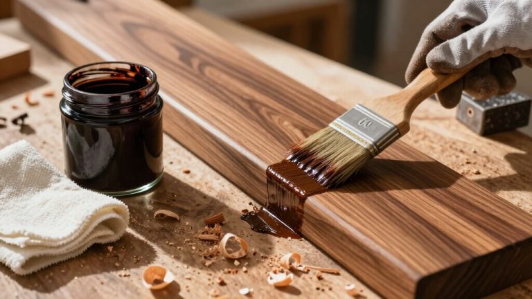
This ensures a cohesive, practical design that highlights walnut’s versatility. For best results, applying the appropriate wood stain can enhance natural grain and protect the wood surfaces.
Economic Factors Influencing Wood Selection With Walnut
Since walnut wood commands a premium price due to its limited availability and high demand, you must carefully consider economic factors when selecting companion woods.
Walnut’s cost, ranging from $8 to $12 per board foot, necessitates pairing with more affordable hardwoods like oak, maple, or cherry to balance project budgets. Its rich color and unique grain patterns also influence the choice of complementary woods to ensure aesthetic harmony. Understanding the material characteristics of companion woods helps optimize the overall quality and performance of the final product.
Prioritize companion woods with stable supply chains to minimize price volatility and procurement risks. Additionally, factor in walnut’s exceptional durability and low maintenance, which justify its upfront cost by reducing lifecycle expenses.
Sourcing walnut sustainably and locally not only cuts transportation costs but also aligns with eco-friendly market trends, potentially enhancing product value.
Tips for Creating Visual Harmony Using Multiple Wood Types
When combining walnut with other wood types, you’ll want to carefully balance tones and undertones to achieve visual harmony.
Walnut’s neutrality allows pairing with both warm and cool woods, but matching undertones is essential to prevent visual clash. For example, maple is often preferred for its light color and visual contrast, making it an excellent choice alongside walnut.
Use repetition and spread wood tones evenly across the space to maintain cohesion.
Consider these practical tips:
- Pair walnut with woods like maple or white oak for contrasting light tones that complement walnut’s depth.
- Match undertones: warm walnut with warm woods, cool walnut with cool woods to unify appearance.
- Incorporate natural finishes and textiles as visual bridges between wood species.
- Anticipate aging effects; select woods with compatible color shifts to guarantee long-term harmony.
Frequently Asked Questions
Can Walnut Be Safely Used Outdoors With Other Woods?
Yes, you can use walnut outdoors with other woods, but choose species with similar rot resistance like cedar or cypress to guarantee matched durability.
Avoid pairing walnut with woods that absorb moisture differently, as this causes joint stress and warping.
Use protective sealants and maintain regularly to preserve stability.
Keep in mind walnut’s moderate outdoor lifespan and structural limitations, so reinforce or limit use to decorative, light-load components for best results.
How Does Humidity Affect Walnut and Paired Wood Stability?
Humidity directly impacts walnut and paired wood stability by causing expansion and contraction as they absorb or release moisture.
You’ll notice walnut’s dense structure limits moisture uptake, but paired woods with different hygroscopic behaviors can create joint stress.
To maintain stability, you must kiln dry all woods to 6%-8% moisture content and acclimate them in similar humidity.
Without controlling environmental RH and sealing finishes, expect warping or cracking over time.
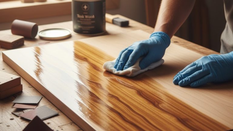
What Finishes Best Protect Walnut While Enhancing Contrast?
You’ll want to select an oil-based urethane like Arm-R-Seal or polyurethane for the best protection and enhanced contrast on walnut.
These finishes deepen the grain’s natural hues while providing durable scratch and moisture resistance.
For easier maintenance and moderate contrast, consider Danish oil or tung oil.
Applying multiple thin coats with proper drying time guarantees uniformity and depth.
Wax over oil or poly adds subtle sheen and boosts contrast without altering color.
Are Walnut and Bamboo Compatible in Furniture Design?
Imagine walnut and bamboo as dance partners: one dark and stately, the other light and swift.
Yes, they’re compatible in furniture design if you manage their contrasting weights and grains skillfully.
Use coordinated finishes to unify their appearances and balance their densities.
Bamboo’s moisture resistance complements walnut’s elegance, making a practical, sustainable duo.
With precise machining and thoughtful design, you’ll create pieces that blend durability, aesthetics, and eco-friendly appeal seamlessly.
Can Reclaimed Woods Be Paired Effectively With Walnut?
Yes, you can effectively pair reclaimed woods with walnut.
Using reclaimed oak, hickory, maple, driftwood, or cherry, you’ll create balanced contrasts in color and texture.
Employ design techniques like herringbone patterns, live edge detailing, or color blocking to highlight walnut’s richness.
This approach enhances sustainability by reducing virgin timber use and adds unique patinas and historical character.
The result is durable, custom furniture pieces that blend rustic authenticity with walnut’s refined warmth.
Bringing It All Together: Crafting Harmony With Walnut
When pairing wood with walnut, you’ll want to think like a conductor, balancing tones and textures to create harmony. Choose woods with complementary undertones like maple for light contrast or cherry for warmth to avoid visual discord.
Consider the design style and budget to make practical decisions that enhance walnut’s rich character. By thoughtfully combining different woods, you’ll orchestrate a cohesive, elegant look that’s both functional and visually striking in any space.